Experience Cloud Customer Portal
This is a project where I led design efforts from project pilot to product launch for a Salesforce implementation. I conducted user research and developed iterative prototypes to design an end-to-end portal experience, including the homepages, login experience, and transaction screen flows, utilizing Adobe Creative Suite and Experience Cloud Builder.
Role: Design Lead | Project Duration: 2.5 Years | Team Size: 4-9


Solution
The Salesforce Experience Cloud Portal my team and I built unified customer and employee interactions, revamping administrative workflows with a user-centric approach. The result was a significant boost in efficiency, a better customer experience, and higher employee engagement.
Challenge
Due to a fragmented accounting system that relied on spreadsheets, PDFs, emails, and disparate financial tools, the administrative department faced significant challenges. Accountants were forced to perform excessive manual data entry and error correction, which created bottlenecks in customer request processing and burdened the staff with a high volume of inquiries.
Overview
Research
Interviews
Joining the team during the discovery phase, I quickly got up to speed by reviewing existing research and documentation. I then helped conduct stakeholder interviews to understand business goals, pinpoint high-priority workflows, and identify user pain points with the legacy system. This foundation allowed me to develop user personas and map out core workflows, providing the team with a clear, shared vision of the users and their objectives.
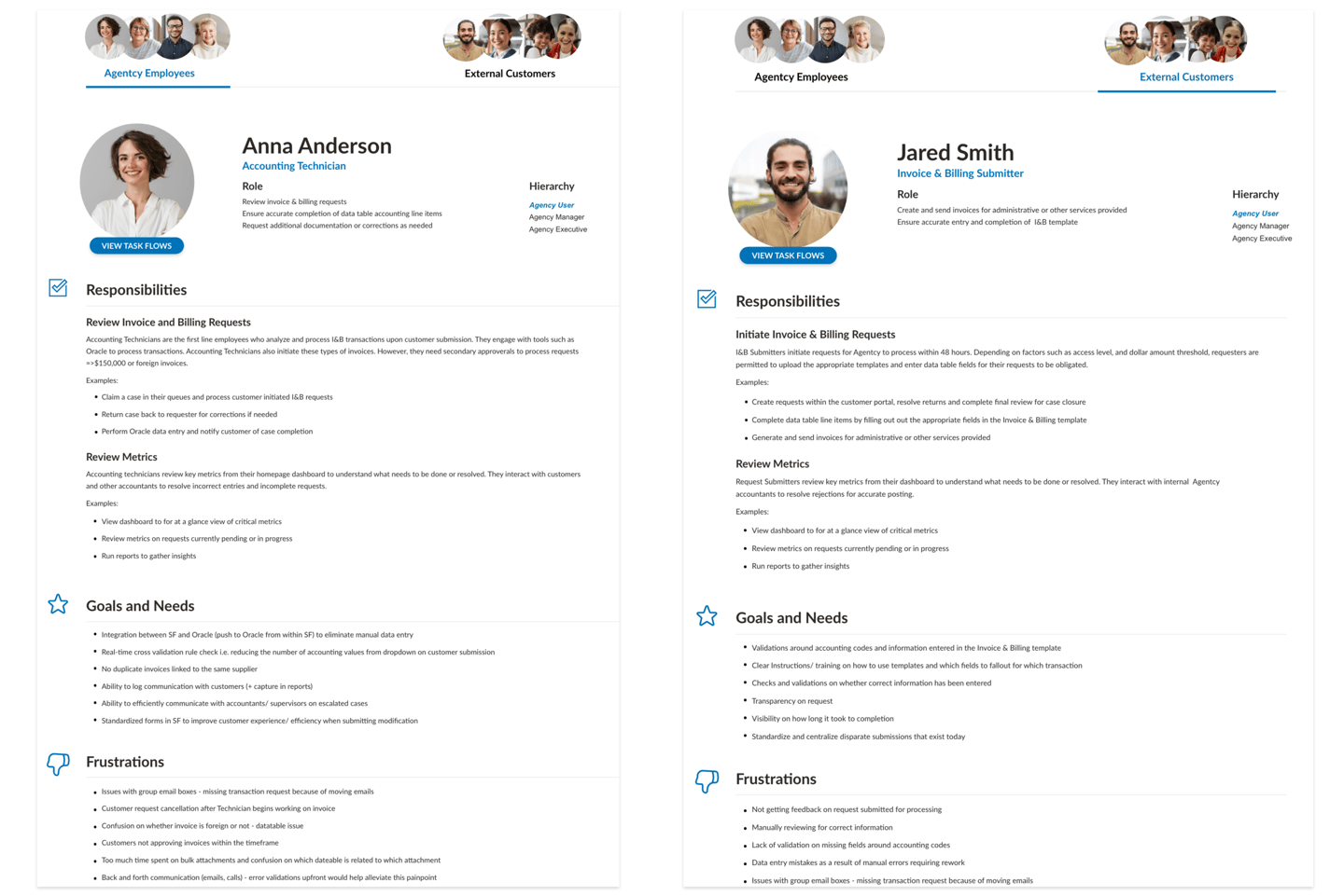
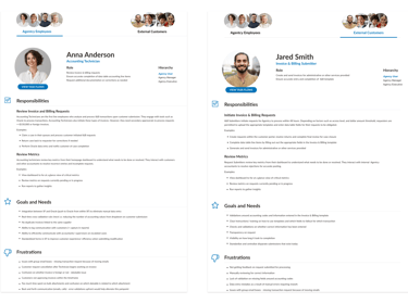
Role-Based User Personas
After synthesizing insights from the interviews, I led a session with our internal team to identify patterns in user needs and goals. This process resulted in an initial set of user personas, each detailing a specific role, their typical scenarios, goals, and frustrations related to the project. I refined these personas with stakeholder feedback to ensure they accurately represented our target audience.

Information Architecture
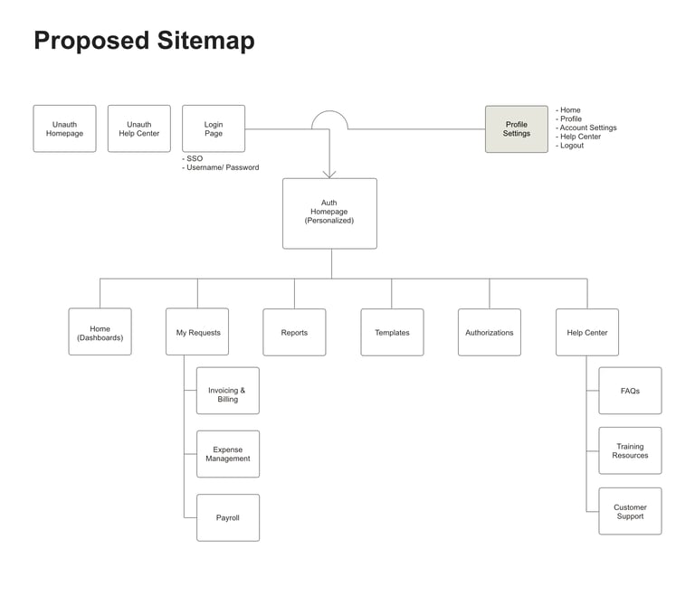
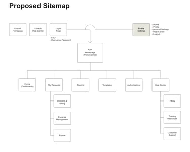
Site Map
With a solid understanding of our users, I facilitated a workshop with our Salesforce Architect and functional team to create a future-state site map. We based the structure on our research insights, prioritizing key user needs. The sitemap included a "My Requests" section for submissions, the core function of the portal, and a "Templates" menu to address user concerns about finding and completing forms. We also incorporated an "Authorizations" section to manage access to accounting modules. In addition, users can access help center without having to log into the portal as there were no restrictions around security for its content.
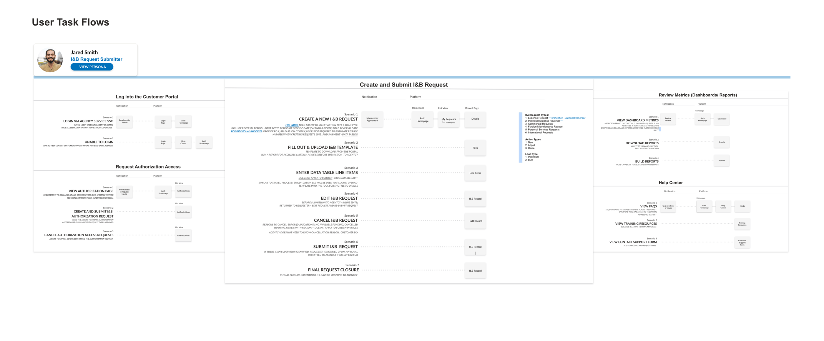
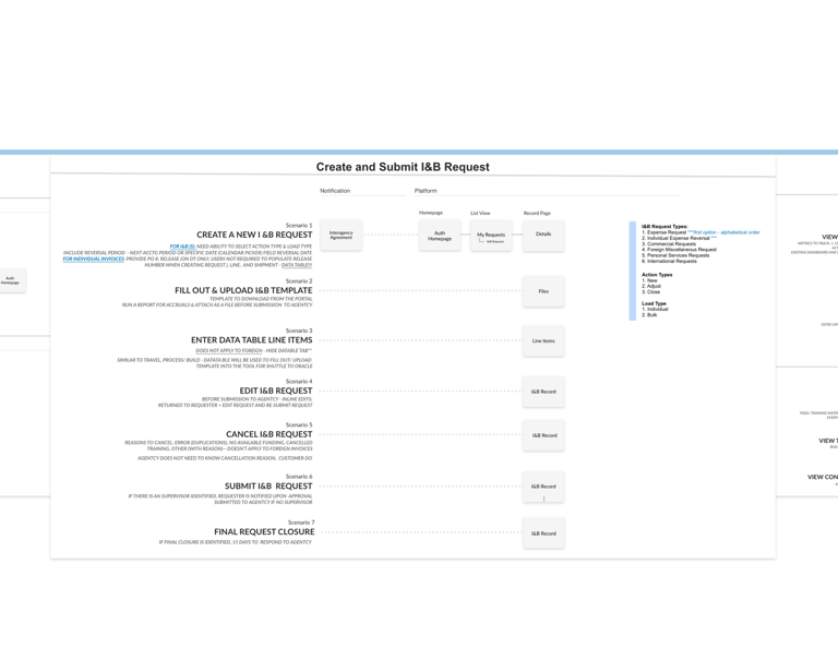
User Task Flows
To gather user centered requirements, I collaborated with SMEs and internal team members to map out the step-by-step actions each persona might encounter as they complete major tasks such as logging into the portal, creating request and reviewing metrics. These scenario-based task flows were crucial for the entire team, as it allowed me to quickly begin creating mockups, the Business Analysts to generate user stories and the Architect for structuring the portal experience. The project manager also referenced it often for prioritization and scoping work.
Visual Design
Style Guide
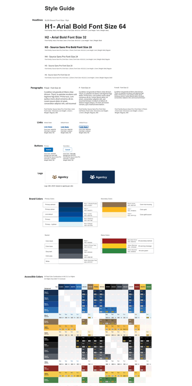
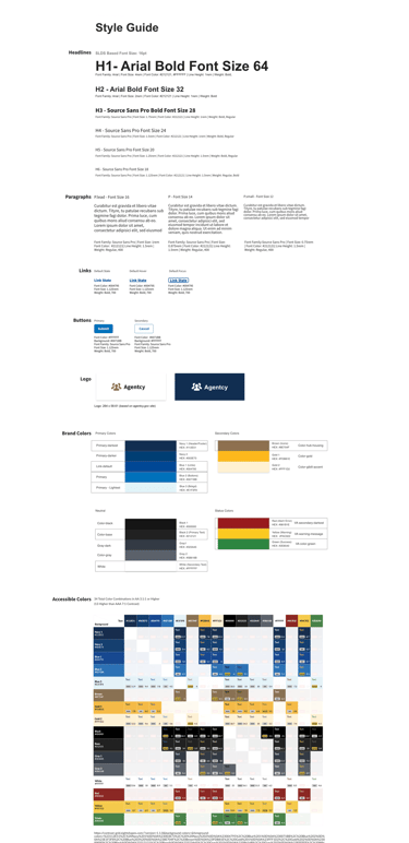
As we were capturing user task flows, I dedicated some time to review the main bureau's brand guideline in order to curate a targeted style guide with a cohesive visual language for this portal experience. I focused on the essential elements such as typography, button styling, color palette. I also established a tone and voice for the site content to ensure a consistent user experience. To align with the organization's identity, I made sure the style choices met the main bureau's brand while ensuring it had a modern look and feel. In addition, I used an accessibility checker to confirm that all color combinations met contrast requirements, particularly for color and text.
Mockups
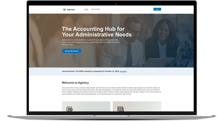
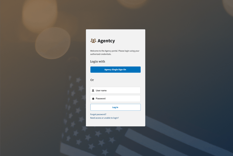
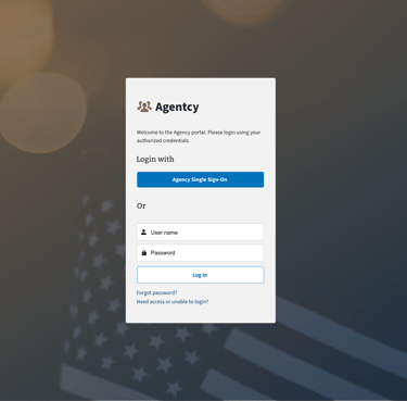
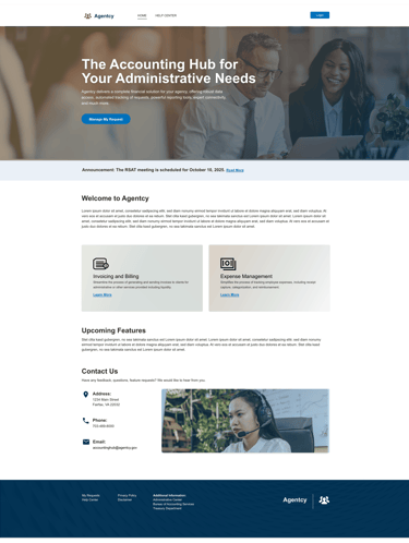
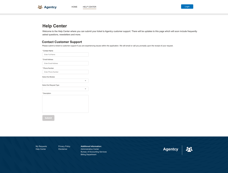
With the sitemap, task flows and style guide in place, I began creating mockups for the unauthenticated portal experience. This was a strategic decision; since the client was still finalizing which accounting modules to build, focusing on the unauthenticated pages (homepage, login screen, and help center) was an efficient use of time. These pages were less likely to change drastically and provided an immediate, tangible demonstration of progress.
The new homepage offered a visually appealing facelift, while the login screen was designed for a seamless authentication. The help center was also a key focus, as it empowered users with self-service options, such as newsletters and access requests. I also designed the help center to be scalable, showing how it could expand into a training hub and FAQ section as more modules were added. This proactive approach helped build trust with the client and garnered positive feedback, demonstrating the project's potential for success.

User Testing
Prototypes
With the client's approval on which accounting modules to build, I developed prototypes for the authenticated pages. I worked within our scrum team to continually refine user task maps and personas at the start of each sprint, ensuring alignment and continuous feedback from both the project team and the client. I then tested and iterated on these designs, working closely with the development team to ensure technical feasibility within Salesforce Experience Builder before getting final sign-off from key stakeholders.
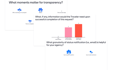
To create the most effective experience, I also conducted A/B testing on two different designs for various pages of the portal. Using Menti polling, I gathered feedback from users on areas such as button placements and home page layout preferences. For instance, I tested whether they preferred a simple list view of their requests as their authenticated homepage experience or a dashboard with high-level graphs and charts. The dashboard approach resonated most with our primary users. This led us to implement a dashboard, giving users an immediate visual overview of key metrics, progress, and important information.
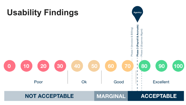
System Usability Survey
After the Phase 1 MVP was developed, I conducted a System Usability Scale (SUS) survey to assess the Agentcy Portal's ease or difficulty use. We initially achieved a score of 72, which indicated the system was perceived as acceptable in terms of usability. I ran the same survey again after building additional modules. While the scores remained above the 68 percentile threshold, it had dropped slightly between phase 2 and phase 3 implementation.
To understand why, I spoke with participants and analyzed the feedback. We concluded that the system's complexity was increasing due to a wide range of users, complex business requirements, and compliance regulations. The lower score wasn't a failure of design but rather a signal that the system now required formal training. We shared this insight with the client and change management team, who were already in the process of creating training videos and FAQs to support our users.

Following product launch, we measured performance indicators to evaluate the new design. The customer portal's usability results were a clear indicator of the project's success:
96% of users were able to easily track the status of their requests.
93% of users found the customer portal easy to use.
78% of users actively engaged with the new dashboard, accessing it weekly to view performance reports.
Our clients and their customers were highly satisfied with the new application. As a direct result, our contract was renewed to continue building additional modules. This project not only delivered a successful product but also resulted in a strong relationships with the client and my team. We all met at the annual DC Salesforce Tour after several months of working together virtually.
In conclusion, this project demonstrated the power of a user-centered approach, from initial discovery and persona development to continuous testing and iteration. By prioritizing user needs and collaborating closely with stakeholders, we delivered a product that was functional, highly effective and enjoyable to use.
Results
Feedback
"Solyana’s HCD design work is the biggest visible difference from the last project. Also my intern wants to be her when she grows up." –Product Owner
"Solyana was challenged to analyze and solve large complex initiative to create a truly Human Centered Design (HCD) customer portal with customer experience at the forefront. She was able to leverage existing components from our digital platforms library to create a modern and fully branded portal. This massively accelerated our development and she was able to design this individually as well as create a strategy for how to scale this portal. " —Project Manager